Joiabet
As a prominent Brazilian brand in the igaming industry, the redesign requested focused on reconstructing the brand's appearance while retaining its beloved logo, cherished by its customers.
Tools: Adobe Illustrator
Overview
Joia Bet is a Brazilian igaming website undergoing a comprehensive visual identity overhaul. As a leading brand in the Brazilian igaming scene, the redesign aims to refresh the brand's appearance while preserving its iconic logo, which holds significant value for its loyal customer base. The challenge lies in striking a balance between modernizing the brand's visual elements while maintaining its established identity and rapport with users.


Visual aspect
The brand prominently features Brazilian visuals, with the primary colors being green and yellow, and blue serving as a secondary color.
Initially, the typography lacked clarity and did not contribute to the overall harmony the brand was striving for.
*Illustrative image of old social media creatives*
Problem
The client aimed to infuse elegance into the brand to align it as closely as possible with the market standards while still retaining its Brazilian essence and impact. The challenge was intensified by the client's reluctance to change the logo, placing greater constraints on the design process to ensure that all new elements complemented the established logo seamlessly
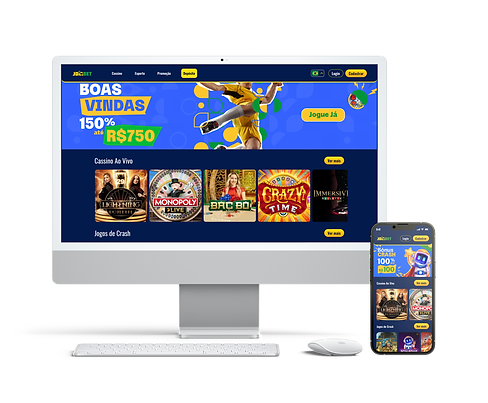
*Image applied on the new website*


Solution
The solution was to redefine the brand by incorporating elements from the existing logo in a dynamic, friendly, and, importantly, Brazilian manner.
The use of geographical elements was pivotal in reshaping the brand's image, with an abstract representation of the Brazilian flag also being integrated. By employing sharp shadows, overlays, and elements from reality, the new visual identity gradually took shape and, naturally, was adored by the client.

