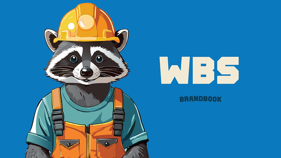
WBS
Western Building Solutions, formed in Oroville, United States by two siblings and an associate, aimed to construct and refurbish homes for purchase. While projecting a professional front, the brand also offers general construction services.
Tools: Adobe Illustrator
Overview
WE BUILD SOLUTIONS originated from the innovative thoughts of two siblings and a companion in Oroville, United States, motivated by an insatiable enthusiasm to conceive and restore houses for anticipated homeowners. Beyond the company's collected appearance lies an energizing task, lighting a blaze inside them to exceed restrictions and reimagine potentials in the domain of home development and refurbishment. The indomitable trio is dedicated to satisfying each client's one-of-a-kind needs and visions through distinctive yet sustainable designs


Visual aspect
By fusing conventional practices with modern methods, they construct quality living spaces tailored to comfort diverse lifestyles. Though the work is demanding, their team finds inspiration in the satisfaction of fulfilled customers who feel right at home, living out their dreams within walls that exude both style and heart.
For this brand, the brothers envisioned a design featuring predominantly blue, with the initials as the centerpiece of the logo. They specifically requested a touch of playfulness in the design while ensuring it maintains the air of seriousness they aimed to convey for the company.
Problem
In addition to the blue color scheme and the initials, the brothers wanted the brand to evoke a sense of fun, accompanied by the image of a raccoon. This creature held significance for them as it reminded them of the region where they lived and was intertwined with the brand's history in a meaningful way.


Solution
To address this, we integrated the image of a raccoon into the brand's visual identity, aligning with the brothers' desire to incorporate elements of fun and nostalgia. Employing an abstract approach, we creatively incorporated the raccoon motif into the design, ensuring it harmonized seamlessly with the initials and blue color scheme. This solution not only fulfilled the brothers' vision but also added depth and personality to the brand's identity, setting it apart in the market while paying homage to its roots and the region it represents.
